BREATHE THE CHARACTER OF THE DESIGN
Defining the modern space is the challenge every designer goes through. Creating harmony and adding character to a living area which is devoid of any requires “the eye” that you so often hear about. So how do you match “the eye” with the perfect products?
Unify colours
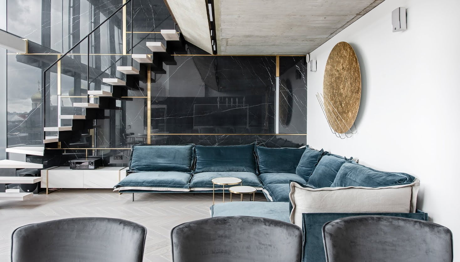
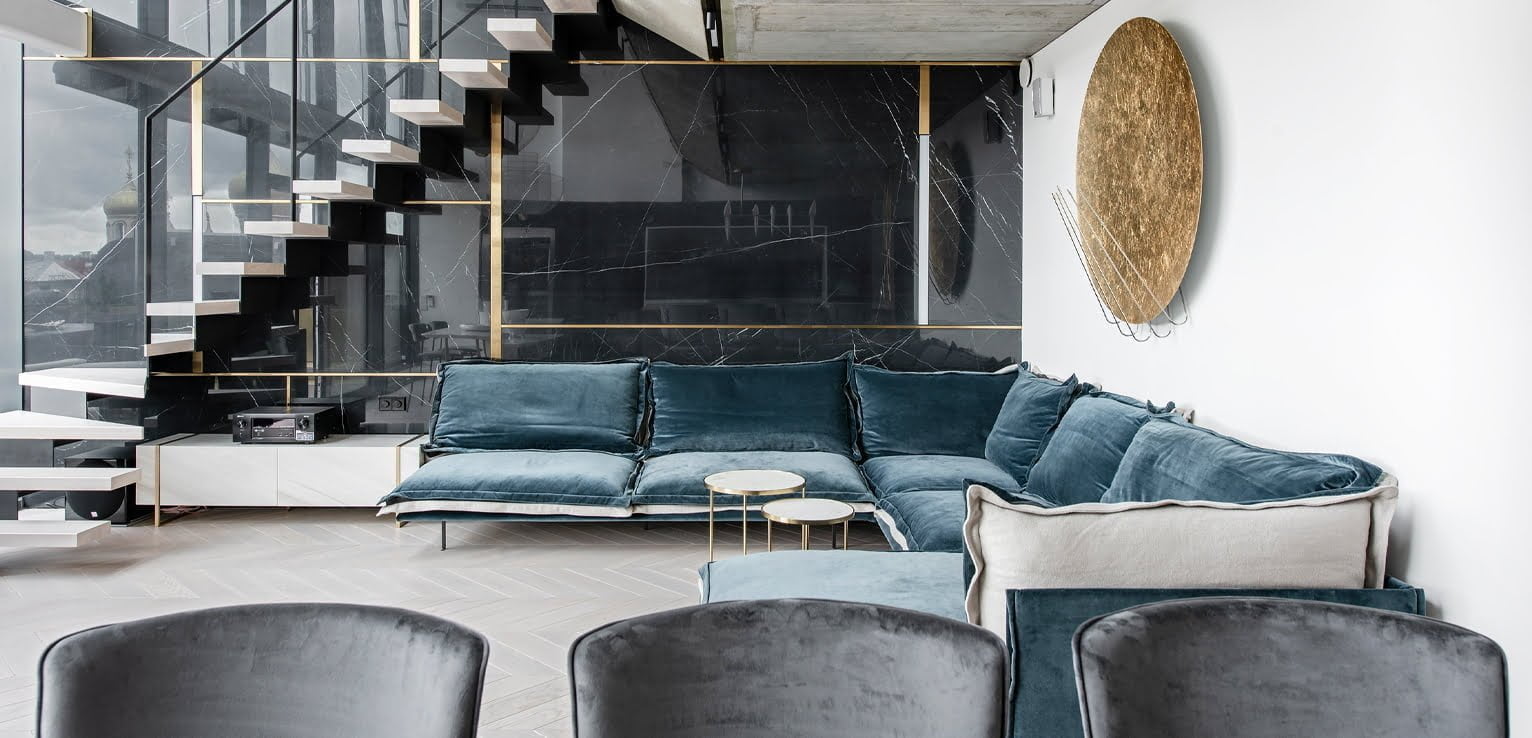
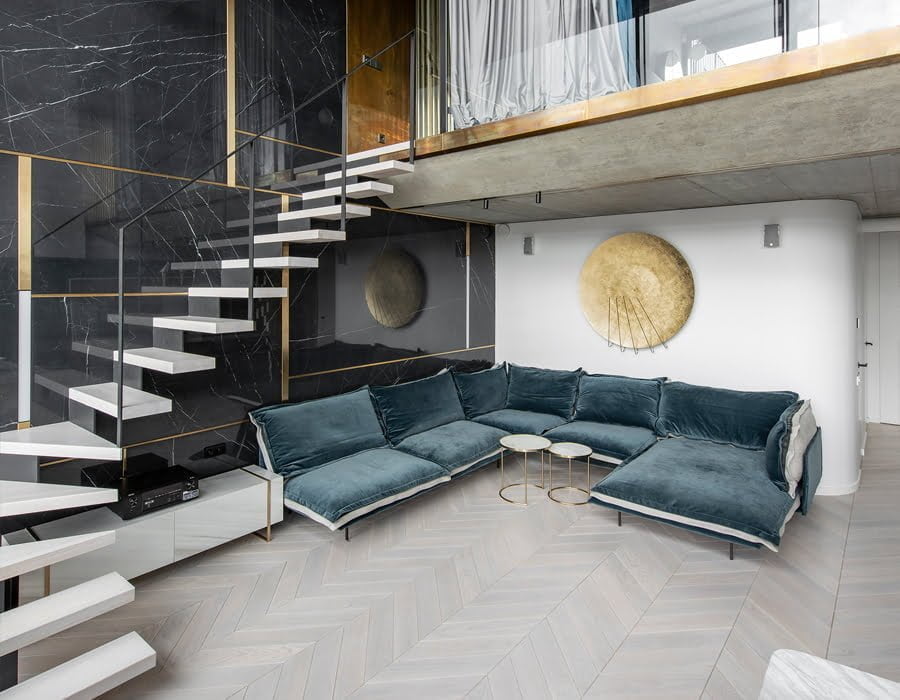
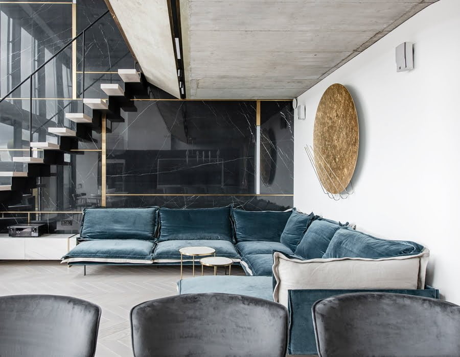
Colour is king in any space, old or modern, but colour is essential to add gravitas to a piece as well. In this apartment, there is a lot going on with just a small selection. Brass detailing weaves between living spaces, uniquely tying in an industrial whilst chic feeling from both within the rooms and those of the bronze rooftops that the open glass facades view from every living quarter.
Colour is king in any space, old or modern, but colour is essential to add gravitas to a piece as well. In this apartment, there is a lot going on with just a small selection. Brass detailing weaves between living spaces, uniquely tying in an industrial whilst chic feeling from both within the rooms and those of the bronze rooftops that the open glass facades view from every living quarter.
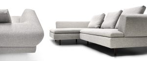
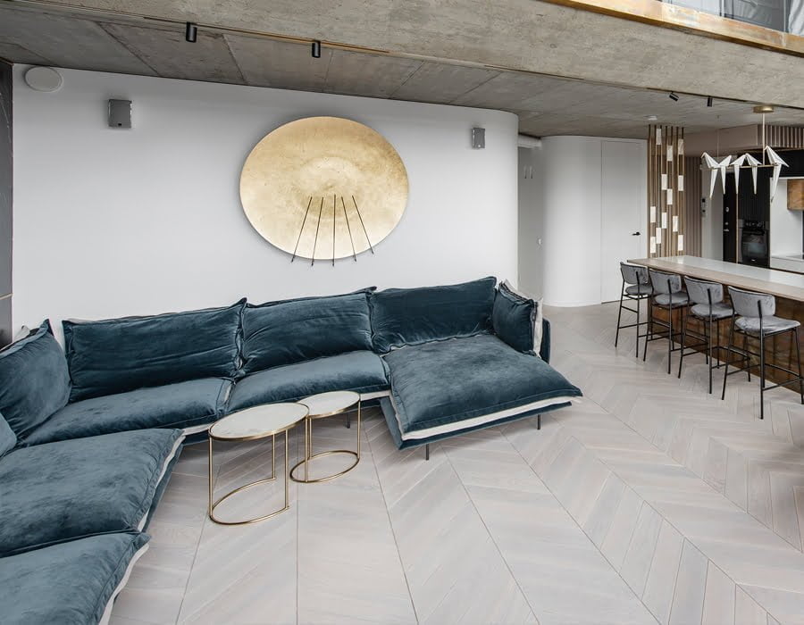
But it is the colour, blue, that requires a formal introduction. Giuseppe Viganò Auto-Reverse cuts a bold figure in the space. It is not afraid to proudly sit whilst the rest of Vilnius busily works in the streets surrounding this luxury apartment. Cutting through the modern and sometimes unforgiving hardness of stone and metal, the crushed velvet sofa brings softness to the space, shaping the room to be inviting and comfortable. It is contrasted with the reverse colour, a cream that allows the floor and the walls to blend into the structure, making the blue pop and stand out even more in this luxury setting.
A theme that runs throughout
Modern design is then subjected to unwritten rules, ones that make a space grand and unique yet with fluid interpretations adding personal touches along the way.
Modern design is then subjected to unwritten rules, ones that make a space grand and unique yet with fluid interpretations adding personal touches along the way.
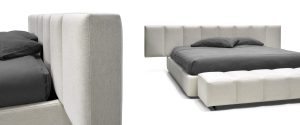
Auto-Reverse Dream continues the theme like few other pieces could dare to capture. The minimal structure, the hand-crafted materials, the reversible cushions, and the limitless opportunities to create something unique with stitchings, zips, colour and material choices has been captured in placing the bed firmly in the middle of the room. The contrast of again, a blue, as seen downstairs with this time, purple, unifies and adds to the theme already clearly established.
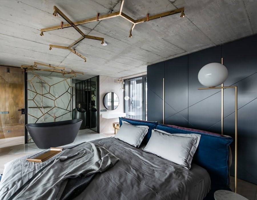
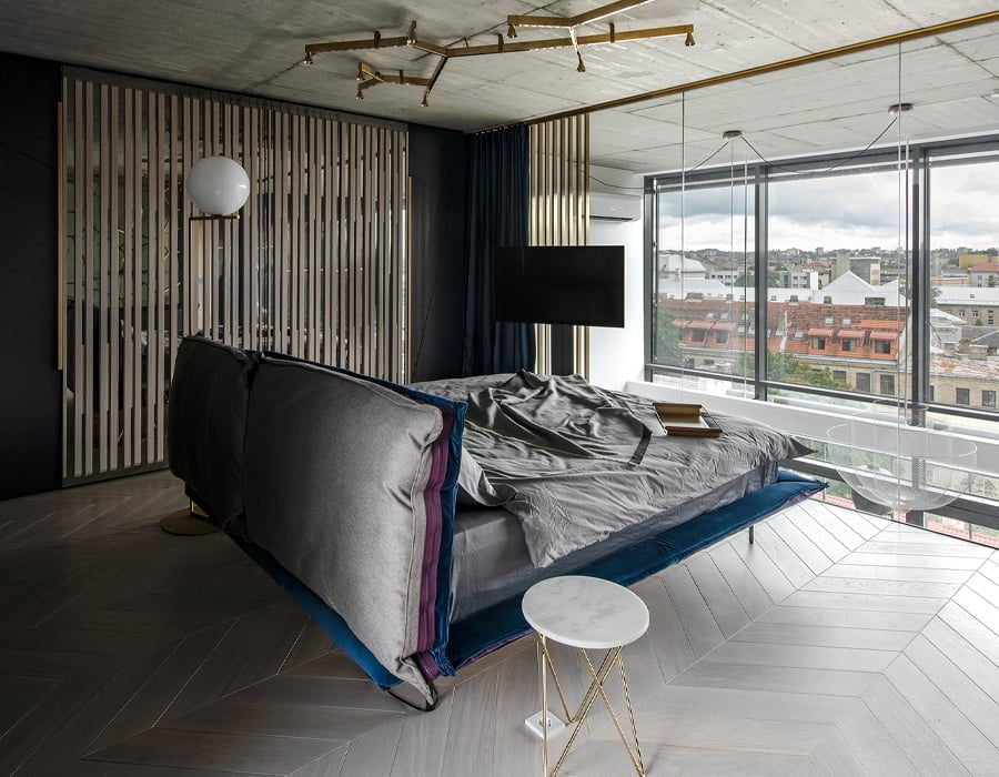
When you bring together every aspect of the apartment, what makes it stand out from other modern interpretations? Colours? Space? Single touches of elegance from the brass, black and even white? It is in the levity that the space brings that defines this apartment. It is in choosing the right objects and materials that can truly unify all of the things above and beyond. Auto-Reverse just happens to do it all.
Thanks to:
Prusta LTD – www.prusta.lt – [email protected]
- Location: Vilnius
- Other participants: architect Ieva Prunskaite
- Photo credits:Leonas Garbačiauskas
