A COFFEE TABLE EVOLUTION
We have described small tables as “supporting acts” and dining tables as “a study of community” yet, when we develop a table of any size or shape, are we really doing them a disservice when we use these terms?
Take a space, fill it with the objects you love, the objects that bring the room together and you start to create a personality; or you reflect your own. But in every room, there is a space for bridging identity, culture and design. Small tables have the unique power of letting other objects take a room on and simultaneously making them functional and beautiful when selected with style at the front of the mind.
Small tables thus, are “balance” in a world of imbalance.
Low tables
Take the greatest living rooms in history, pop culture… your own life. What do they have in common? A place to rest your remote controls, books, a drink at the end of a hard day or just a place to simply put a beautiful bowl of flowers. They are the ubiquitous feature of a living room all over the world and yet, they do not ask for our direct attention, they just have it.
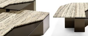
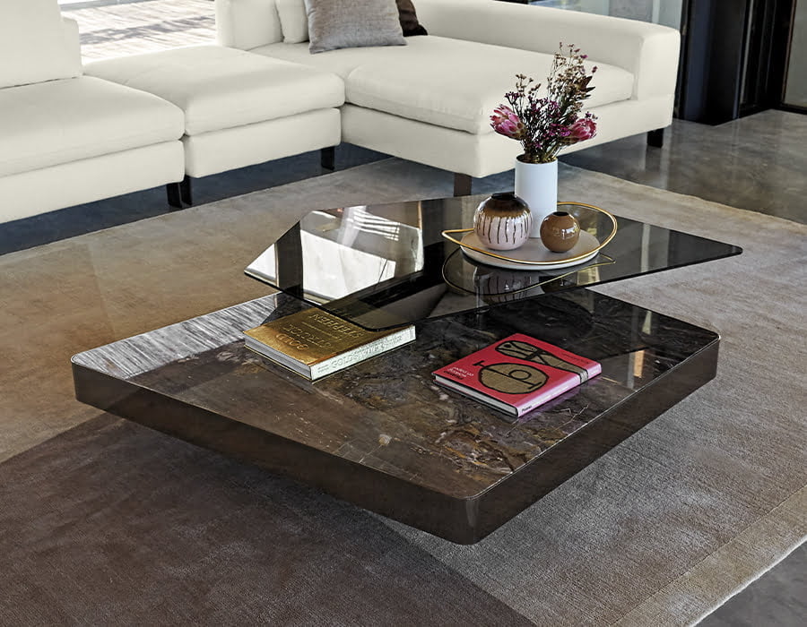
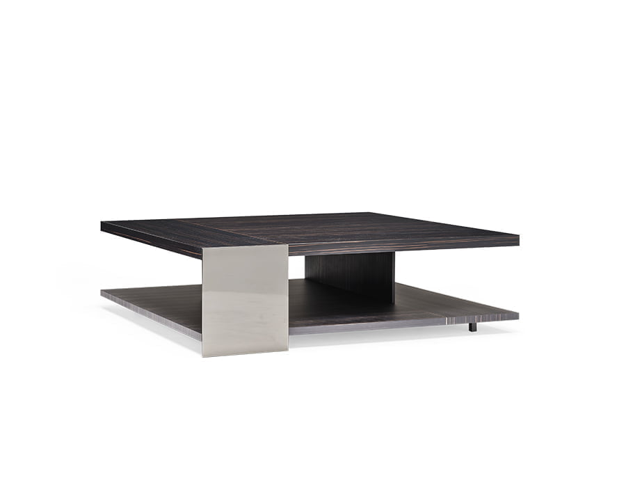
It is within designs like Mauro Lipparini’s, Final Cut and Douglas that we see beauty is enshrined in function. These are simply not tables; they are statements of individual creativity. Douglas asks us all to take a step back and understand how angles, materials and combinations can work together in a room whilst Final Cut is a masterpiece of engineering; calling it a low table is a disservice to something uniquely individual in design and execution.
Seeing through the simple
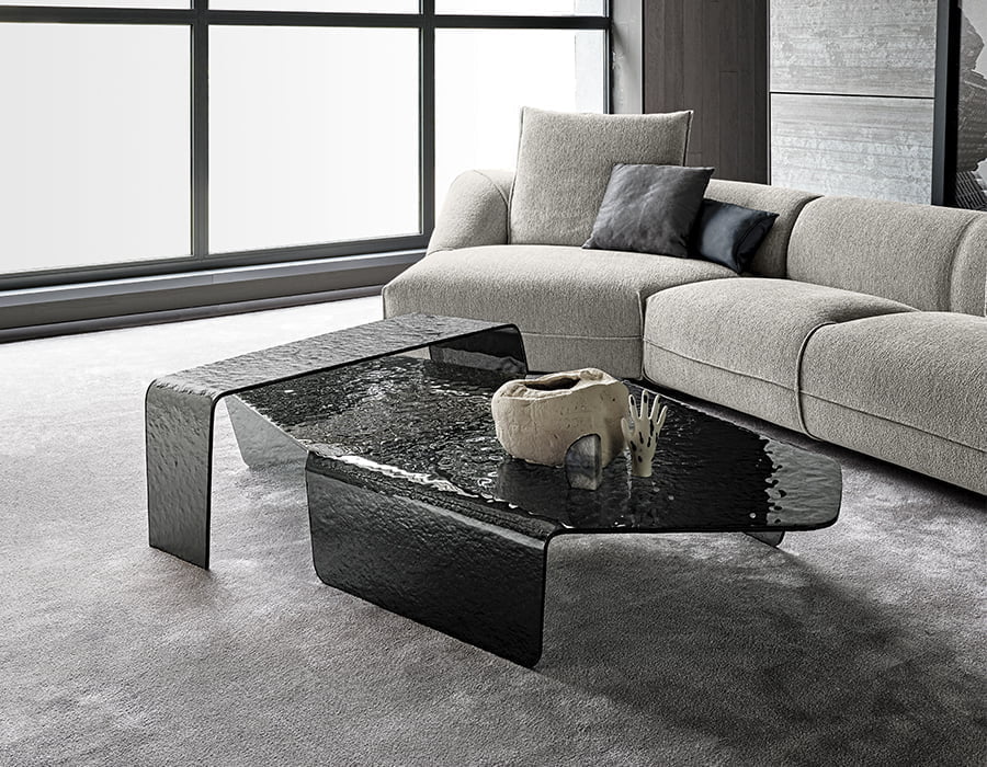
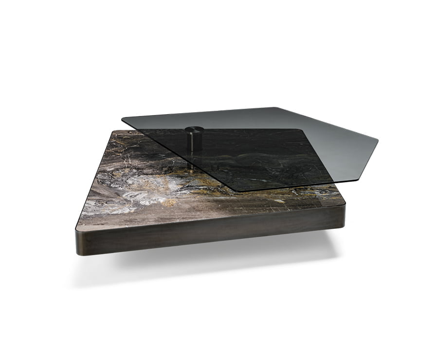
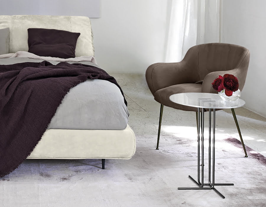
If we search for elegance and equal doses of sobriety, glass is the material of choice in a living space. Used as part of a design in furniture making, they add gravitas to interior design whilst providing a light touch to a room. For the curious consumer, glass gives us a clear view into how something is made.
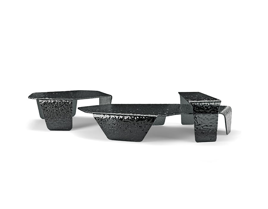
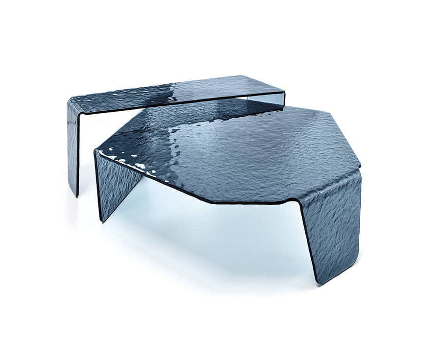
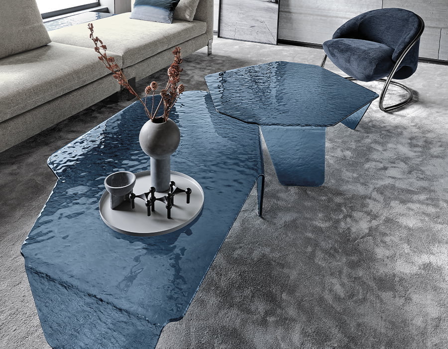
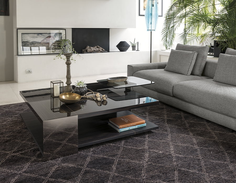
Chimera is the epitome of glass construction. Dainelli Studio has taken a material that can be fragile and made it into something solid; a construct of engineering and design which appreciates the raw material and transforms it into a showcase of sinuous lines, and light absorbing beauty.
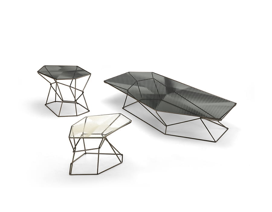
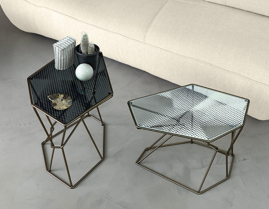
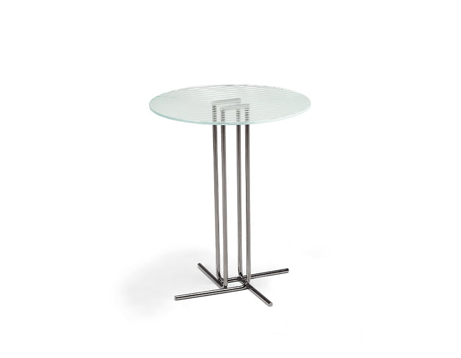
Whilst the glass constructs of Rebus (silk screened) and Odissey (laser cut) are uniquely positioned, Mauro Lipparini has used these constructs of glass engineering to highlight the other facets of these individual tables, their forms. Without glass, you could not appreciate the geometric styling of Rebus nor the subtle elegance of Odissey. They need glass to show you how design is the star of a room and how materials can combine to elevate every aspect of one.
Living with marble
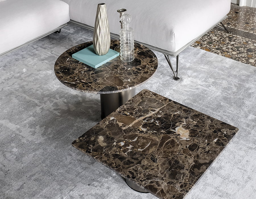
Marble is so intrinsically woven into Italian culture that we sometimes forget just how precious it is; that is why our designers take a step back to showcase that even through the smallest iterations, like a small table, we can create something that screams, artisan ingenuity.
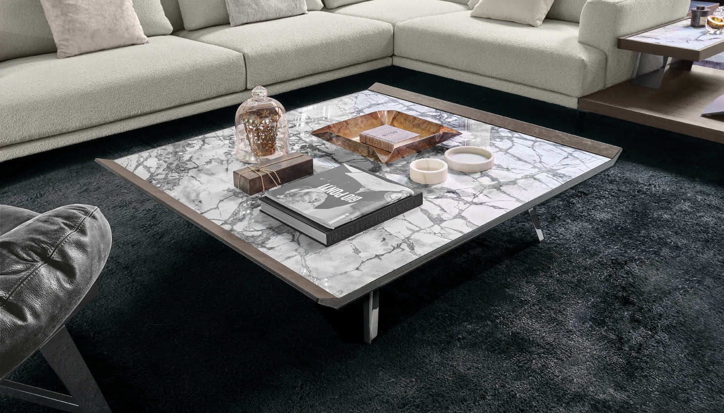
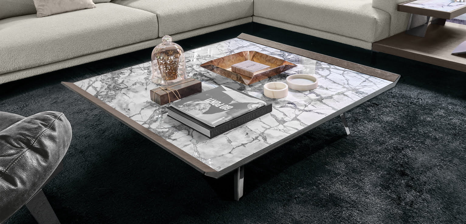
Marble’s beauty is that every slab can be different in colours & shades, different harmonies created through veining, and that no two tables (or creations) will ever be alike.
Marble is a natural material that truly is individual, refining a space and gracing interiors for centuries as a point of beauty.
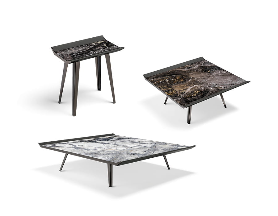
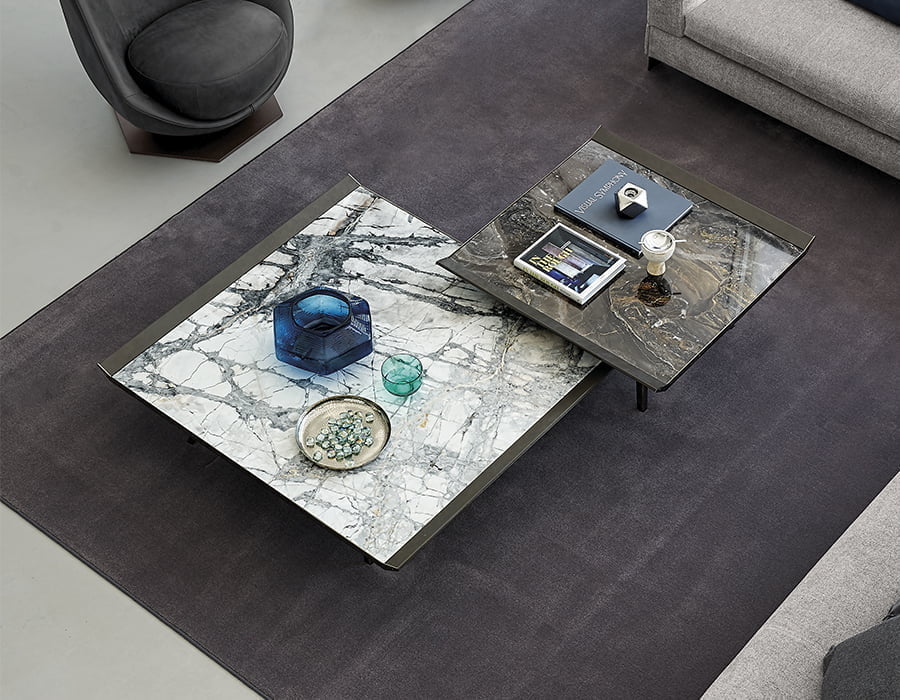
Gino Carollo’s Moon Invaders understands this unique material better than most. He created something that is “a welcoming embrace of the nuanced isometric American art movement of the 80s and 90s” over anything from the 1890s. Enshrined in vegetable tanned leather, this future looking concept is meant to make you admire marble for its natural beauty and how we can emotionally connect to something so ingeniously creative.
Connecting with earth
When we can bring what is outside in, when we can have a spiritual connection with the ground we walk on, when we can meditate and mindfully bathe amongst nature, we become better. Wood is the primary encounter in our interior lives and the artisan, the designer and the creator all have a connection with wood unlike few other materials.
Wood connects our past, present, and future. Wood is warm and connects us to the cold, sometimes harsh materials used in design. Wood can be finished to match different environments.
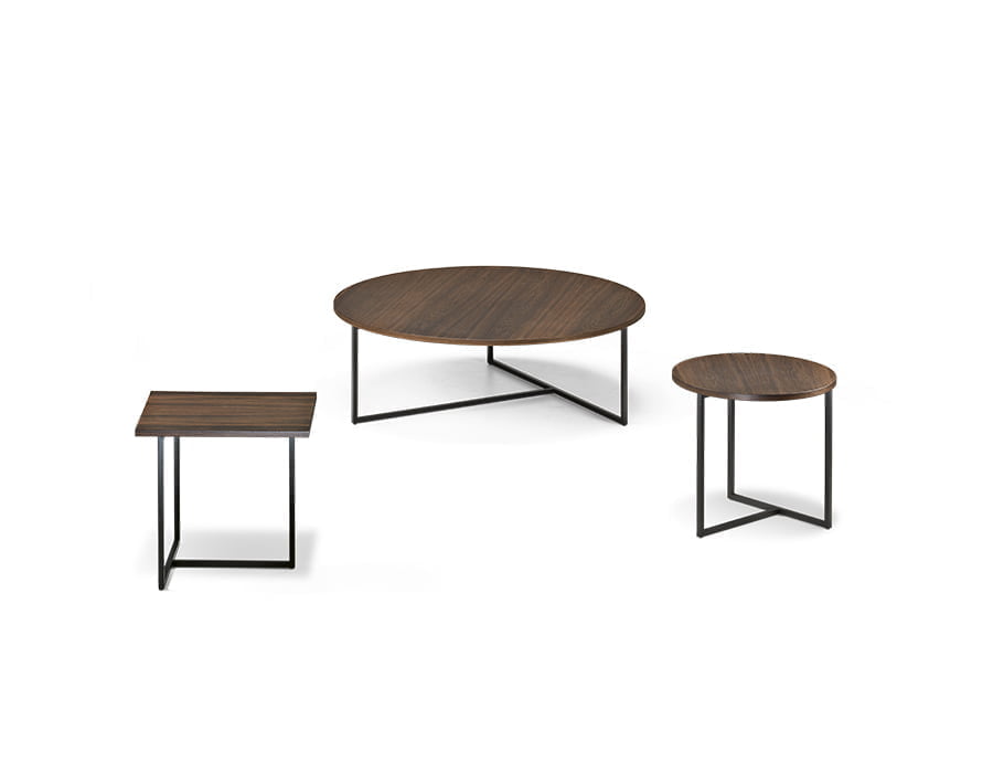
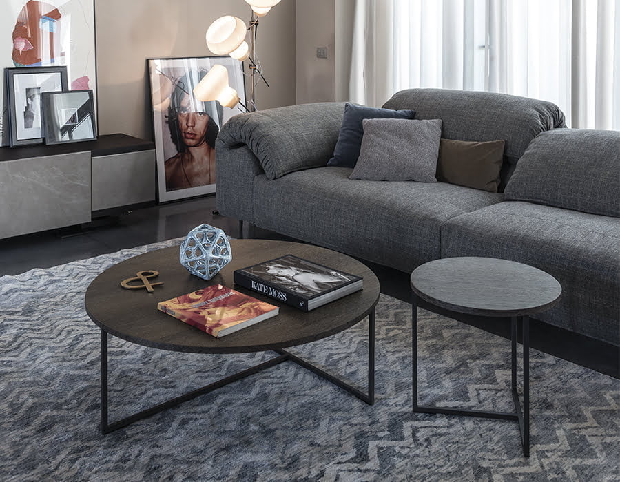
Take one look at Gordon Guillaumier’s, Armonia and you instantly appreciate how wood captures everything we have described. Wood is the counterpoint to the metallic geometric structure, softening the piece whilst elevating its intrinsic simplicity.
Mauro Lipparini’s Noth on the other hand is a measure of wood’s flexibility to appear light and equally sturdy. Wood shouldn’t “float”, but this structure purposely challenges our assumptions, it asks us to look at how this design can be a centerpiece or smaller incarnation to marry any room filled with a connection to the outside world.
A set
When we take a design and create a series of smaller or larger iterations, what are we really doing? The artisan is testing their skills, the designer is questioning interior balance but when they combine, they create something that enriches any interior space.
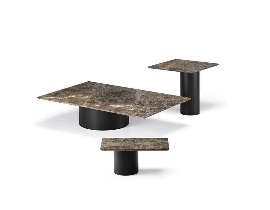
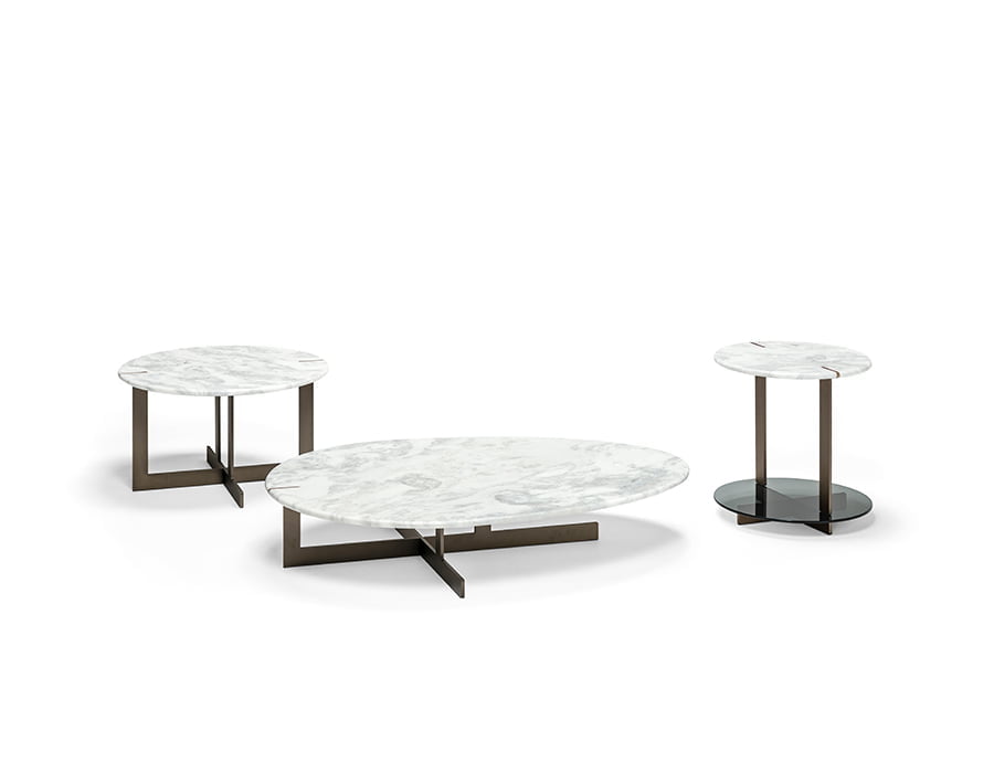
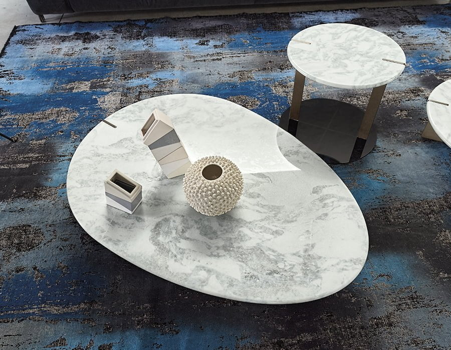
Look at Bartoli Design, Petra. Three distinct forms of imbalance thanks to the marble being offset and yet, their different heights and shapes and even materials make them distinctly different. A large space would hold all of them, yet a smaller space, with two pieces would showcase just how unique a design can be.
And Dainelli Studio understood that with Chimera. The overlapping structures mean that individually, these pieces stand the test of time but combined, they can turn any room into something that yearns to be seen, design that rightly craves attention.
