DESIGN IN MINIMALISM
What is the theory around minimalism? According to Google, minimalist design wants to “reduce works to the fundamental, the essential, the necessary, and to strip away the ornamental layers that might be placed on top.”
But when you think about minimalist design, what does it conjure in your mind? It’s a question we get asked to investigate, ponder upon, and then execute. It’s something that has to be thought of carefully before a first step is even taken, because the total objective needs to be considered with great attention to detail.
Creating space
When pushed to finalise the concept of minimalism, space is a common thread. Creating space, elevating space, lifting space… they become synonymous with the final objective. Thinking about design that can capture space or showcase it is thus essential.
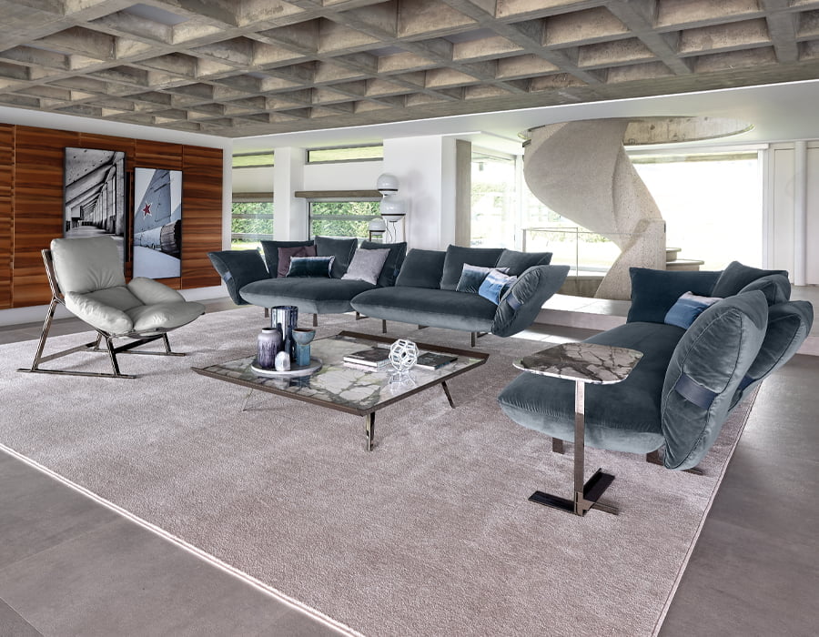
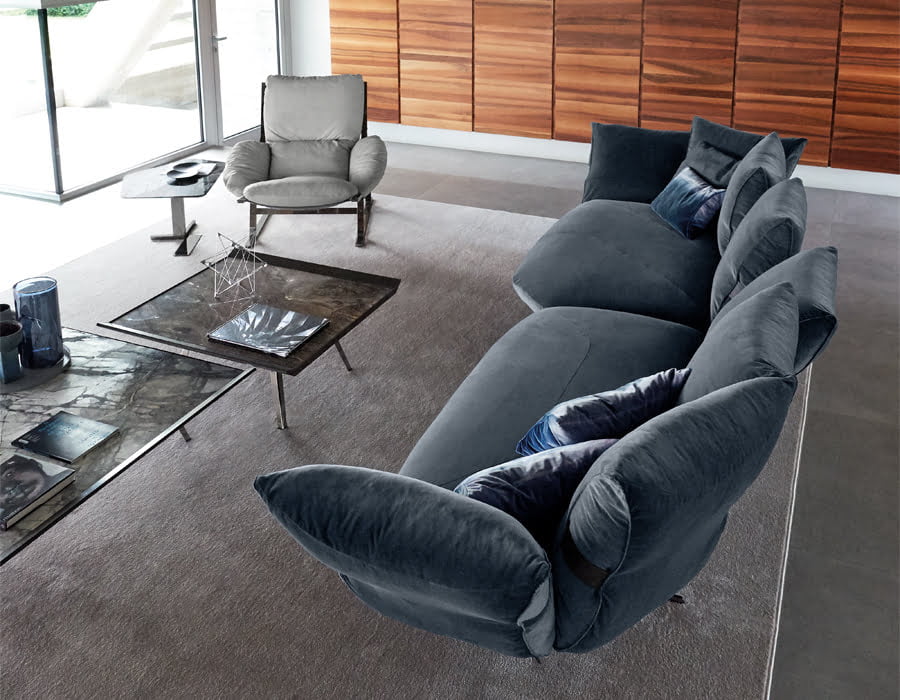
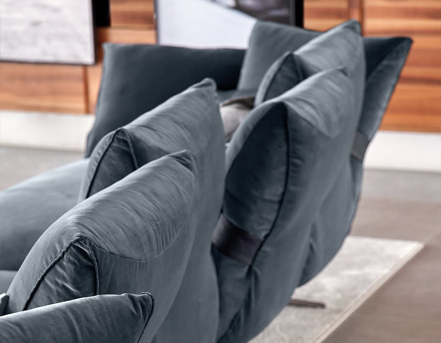
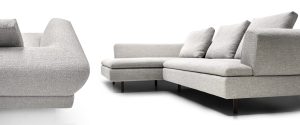
Creating a product that provides elevation whilst holding true to the other testaments of design is of critical importance. Smooth Operator is just one example of this. With its elevated geometry, the couch provides light and space around and underneath, creating a visual floating sensation whilst the soft cushions accompany the movements of the body thanks to thought out mechanical engineering rendering its shape to provide joy and relaxation.
Choosing the right materials
In order to create elevation and enhance minimalist concepts, material choices are also essential. That means having to choose items that reflect and pass light with great ease. Glass is then an essential component of the minimalist matrix and choosing the right designs matters.
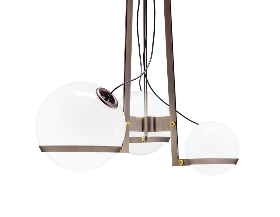
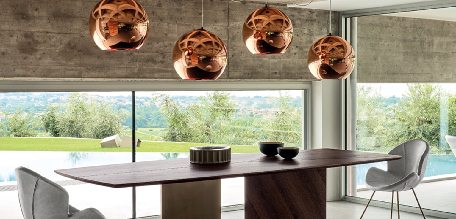
In the suspended version of Gino Carollo’s Bubble Bobble you begin to understand why the overall look is so important. Recognizable by the three glass spheres of different sizes, they are supported by thin metal strips, playing with natural light between the spheres artificially created by the shapes. It’s an emotional construction, one that senses and creates a room’s ambience with ease and elegance, creating space in a vertical dimension.
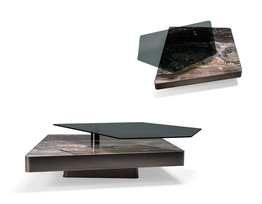
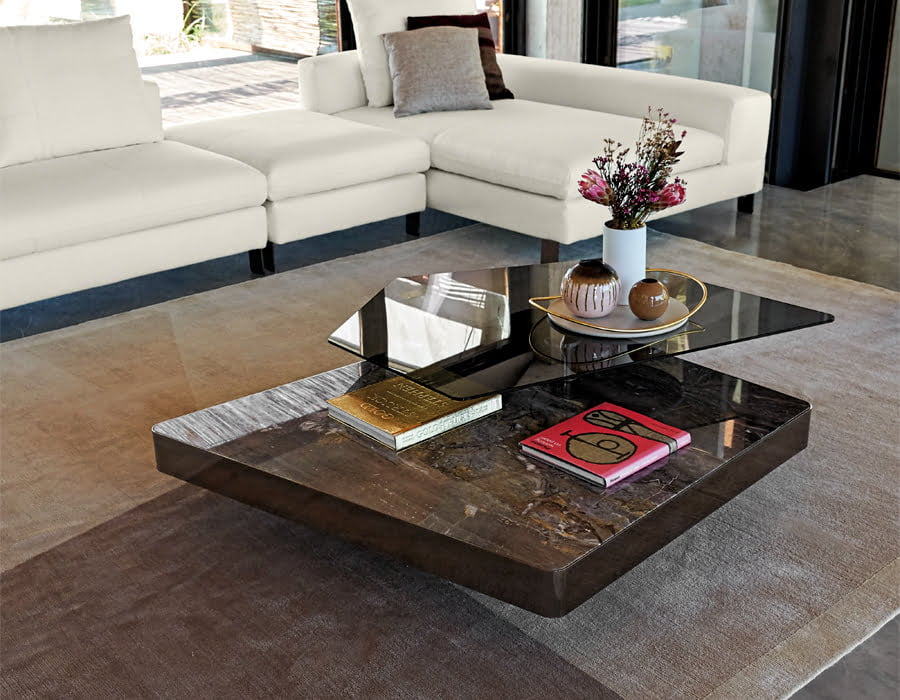
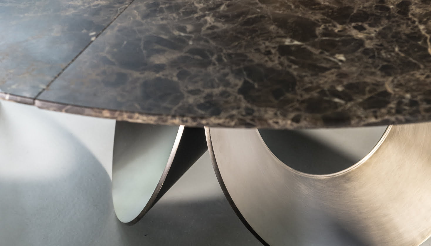
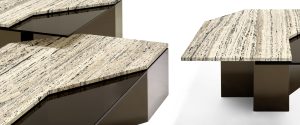
In Mauro Lipparini’s Final Cut there is a slightly different theory about material choice. Blending two different materials with the same final concept, spaciousness. It has a multi-level surface, the upper is a thin smoked glass layer connected to a thick marble top. In its complexity and sophisticated geometric design, this reflects true dynamic living, making this vision more about today’s modern take of living and enhancing the minimalist design principles without compromising on quality or the forethought engineering.
Elegance in the details
And what of the other, unspoken rule of minimalism… elegance? Of course, it’s all subjective, one person’s elegance is another’s gauche. Yet, in elegance we see that it is about striking balance to create a synonymous line of space, materials, and form.
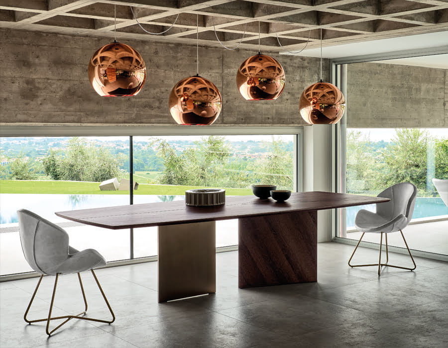
In choosing the dining table for such a high lofted room, minimalism plays its part with Epsilon and Victoria. Double acts don’t come more naturally than this pairing.
Victoria showcases a soft leather material that is subsequently stitched into the design providing an aesthetic and sensorial element, wildly contrasting with the three-dimensional metal framed base. Soft and hard, they play together to lift the chairs’ final design. And what of the table? In Epsilon, Manzoni & Tapinassi bring together a design that links two different worlds. Interior and exterior. The base stands tall and strong, uniting the ground the central structure whilst the top is enriched by a play of metal and wood, carving, and cutting through the surface following the base setup. The end result is a dynamic contrast of soft and hard, brought to life in a room that craves for as minimal intervention as it can muster.
Minimalism is a combination of many different design aspects, one that can create and curtail over-detailing whilst still remaining relevant to a room’s overall look and feel. Choose wisely and you can lift any room into a new, sensorial creation.
